
CPDS – Working through errors
Step-by-step Guide:
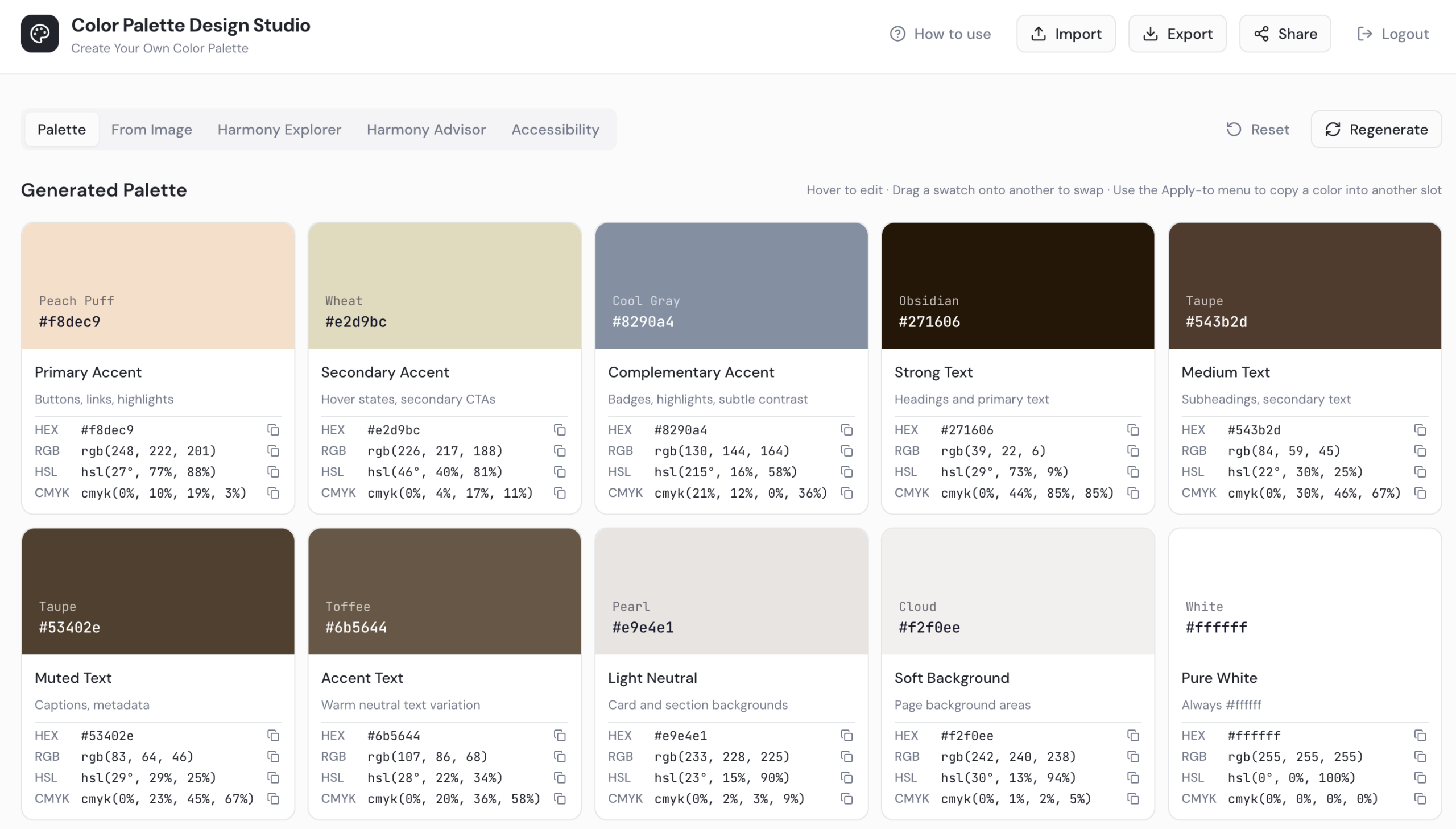
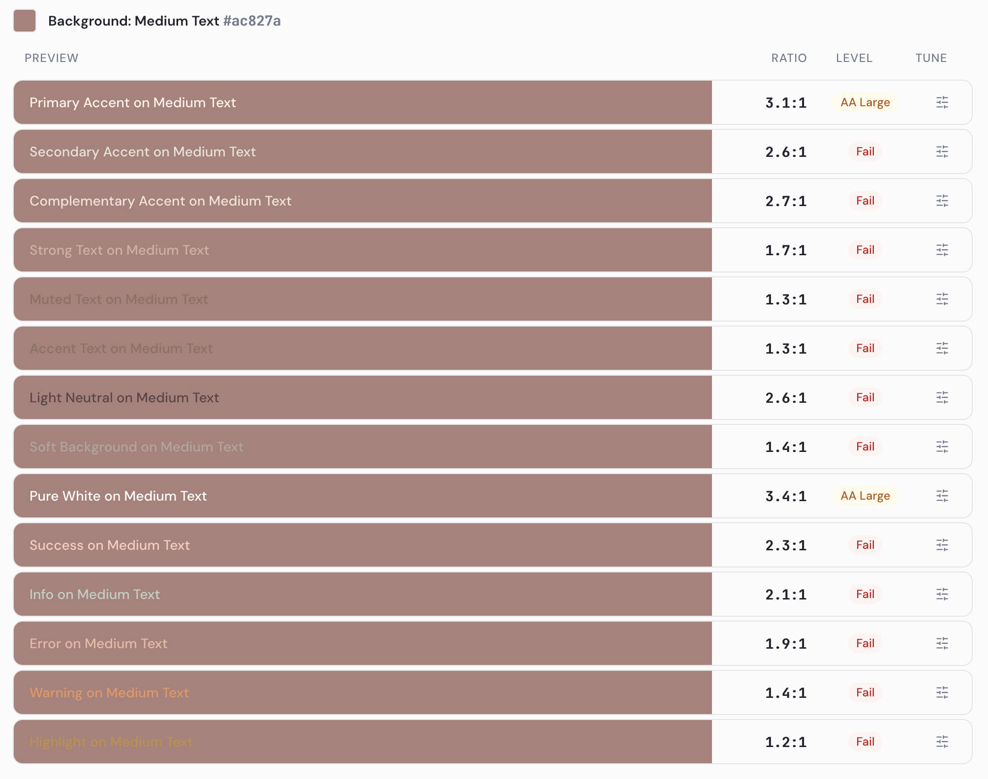
- Review your palette for any error indicators. Common sources of errors: text colors (Strong, Medium, Muted, Accent Text) that fall below the required contrast ratio, and background colors (Light Neutral, Soft Background) that are too dark rather than staying in a light range.
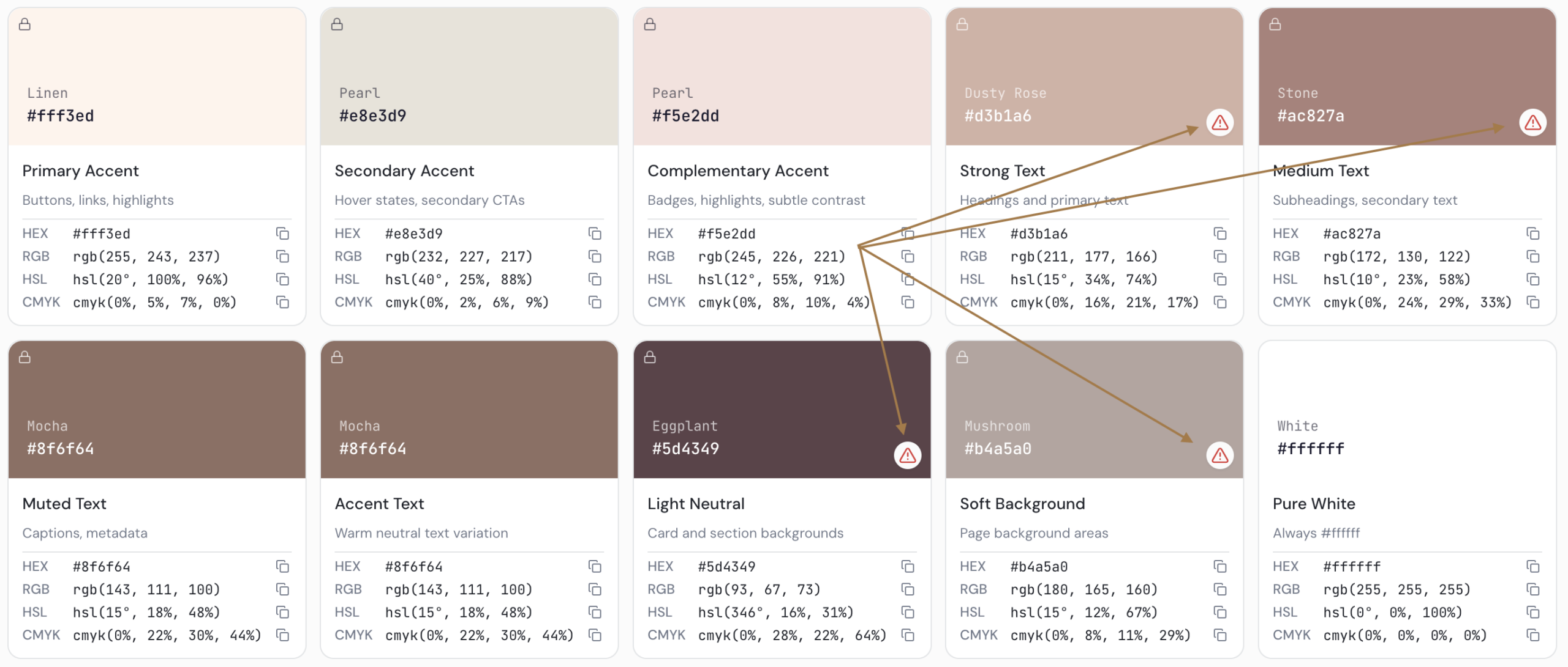
- Rearrange colors by clicking and dragging slots to swap them. For example, move a dark color into a text slot, or move a light color into a background slot. Colors swap positions without being lost.
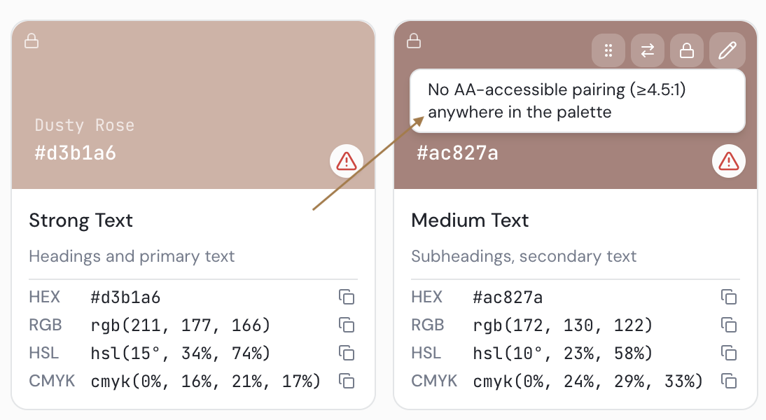
- Once colors are in the correct slots, hover over any remaining error to read the specific issue (e.g., “No AA accessible pairings”).
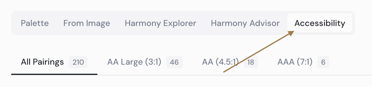
- Click the Accessibility tab for a deeper view. Review the three accessibility standards (AA large text, AA standard, AAA) and the contrast ratio chart at the bottom of the page to understand what each level requires.
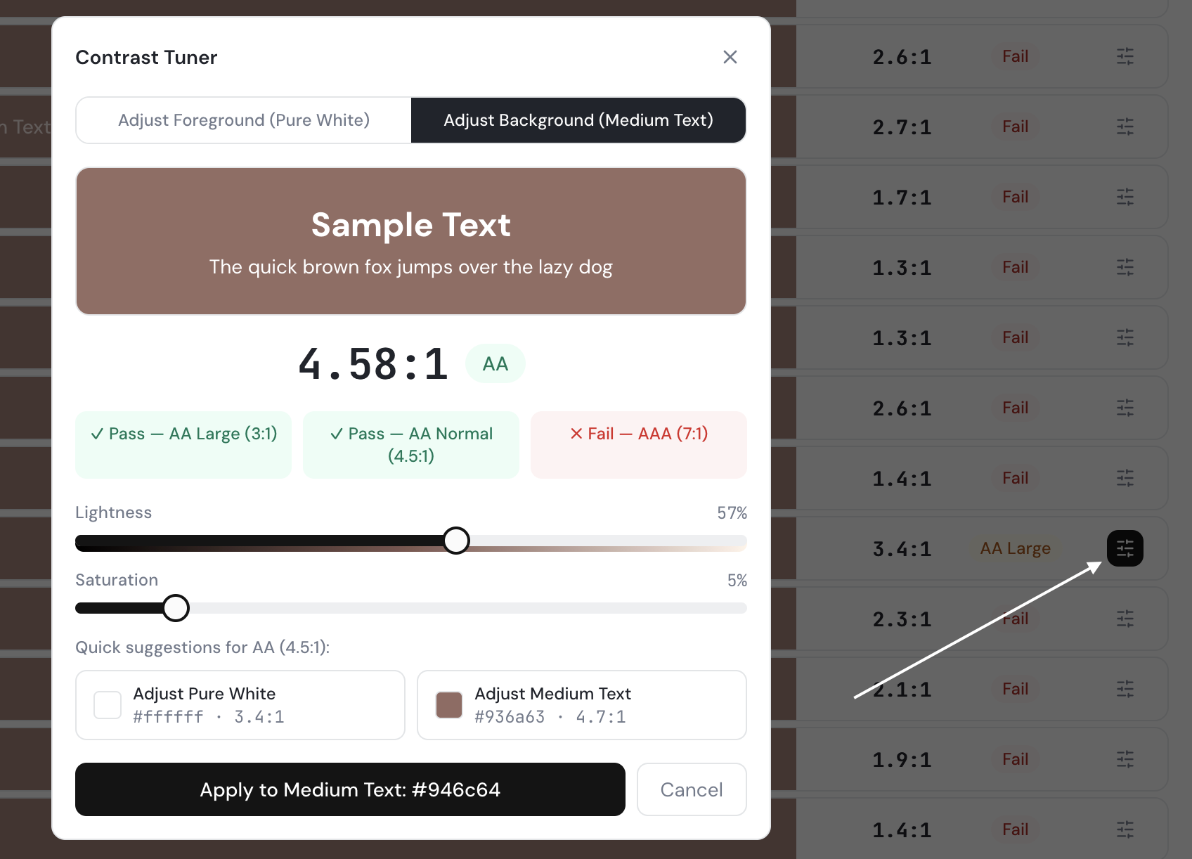
- Use the color adjustment tool on the problem color. Click on either the foreground or background color for the failing pairing, then adjust the lightness/darkness slider until the color meets the AA standard. Apply when done.
In the example below, we switched to the “Adjust Background” option, and reduced the lightness to achieve the AA standard.
- Verify all errors are resolved. Return to the Harmony Advisor to check the palette health score and confirm no Accent Chroma imbalance remains.